Group C:
 Colombia:
 The Colombians bring to the table two very different kits for this World Cup. The home kit looks very nice. From a distance. The unsightly blue diagonal stripes across the shirt are ugly, aside from the bold one across the shoulder. As for the away kit, the fact that I'm not a huge fan of red isn't a great help, but there's nothing offensive about the shirt. In all, the away kit looks nicer than the home, but neither are particularly stunning.
Japan: This home kit actually looks really good, especially on the players. The contrast of the blue from the bright pink piping on the arms and across the shoulders looks so nice when the kit is on, and the colour of the away kit, although aggressive, is also good when combined with the piping. The use of lighter blue on the home kit around the badge represent the "rising sun" of the Japanese flag.
Côte d'Ivoire: Similar to the Cameroon kits showcased in yesterdays blog, the Ivory Coast team come in to the tournament boasting kits with tribal patterns. Both the home and away kits have the patterning on the shoulders, as well as under the arms. I assume this is made of a mesh kind of material to allow sweat to be wicked away on the warm Brazilian afternoons. The colours of orange and green are what we've come to expect from les éléphants, and they look quite good. A nice pair of kits.
Greece: Two very nice, clean kits from the Greek team at this World Cup. There's no messing about with these shirts. Blue and white, and white and blue. Watching Georgios Samaras light up Group C in these kits will be more of a pleasure than usual when he's wearing these kits.
Group D:
Italy: The Azzurri come into the tournament with a relatively un-Italian pair of shirts. Generally, the Italians arrive wearing sharp suits (which they did) and sporting even sharper kits (which they don't). The home kit looks ok, but the overall design isn't quite what we have come to expect. I think the away kit is really quite bland. The stripes down the middle of the shirt look dated, and there's nothing exciting about the way the shirt is cut, or the features of the piping. Overall, a pretty poor showing, especially after the high they hit in 2006 with both their kits, and their performances.
Uruguay: These Uruguayan shirts are nice and simple, and all respect to them for that. The blue in the collar of the away shirt looks really good, and the cut out collar on the home shirt is equally nice. Uncomplicated shirts and nice designs make these quite appealing.
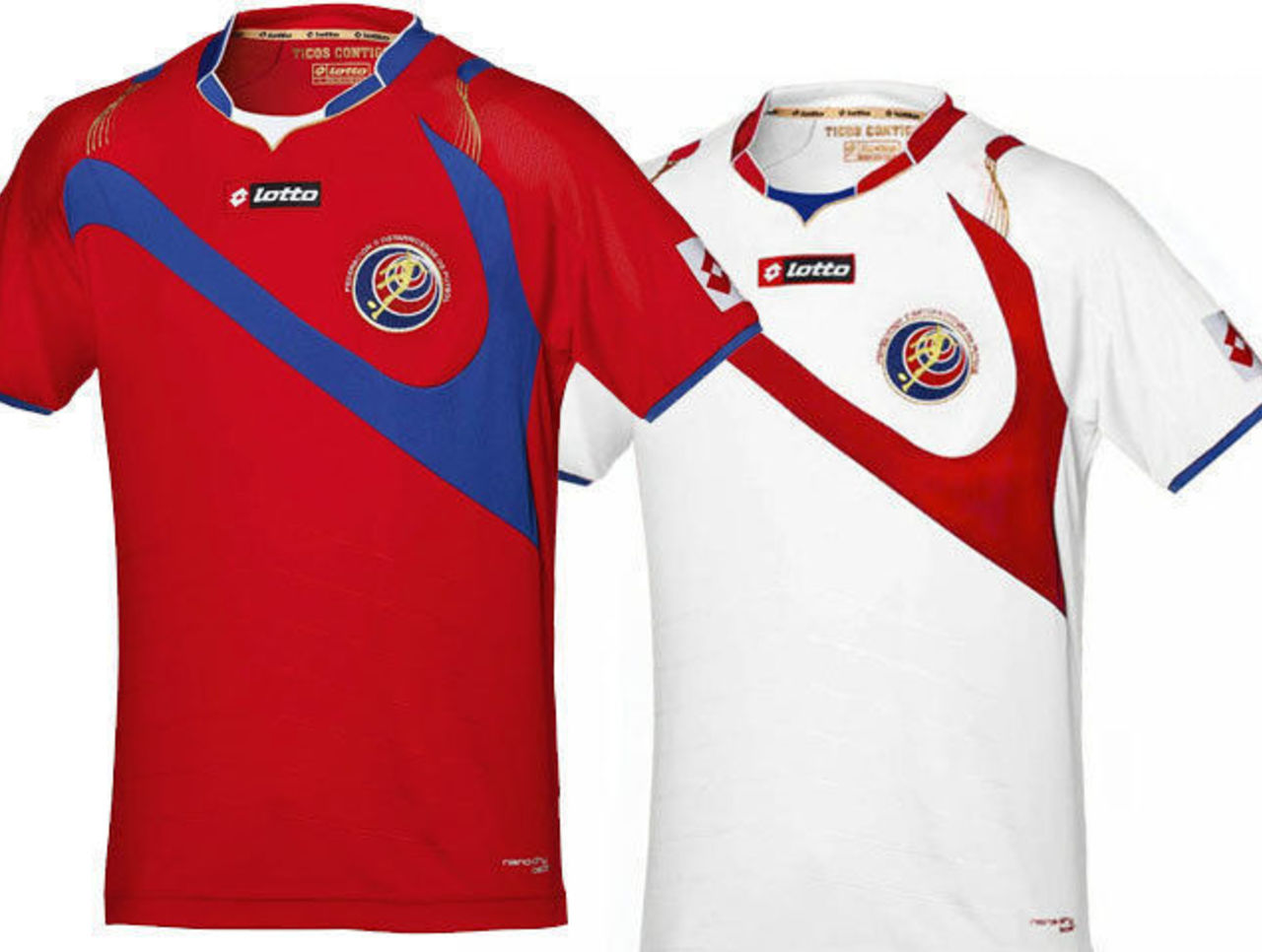
Costa Rica: Nope. Don't like these shirts at all. The design across the shirt combined with the badge makes it look like a goalkeeper diving despairingly for a ball, which is something that, in this group, he could well be doing often. The collar looks nice, but the design on the shoulders is unsightly. In all, not a particularly good showing from the Costa Ricans.
England: Once again, Nike show why they are the manufacturer to beat when it comes to World Cup kits. This England pairing is much better than almost anything they ever had under Umbro. The cut of the kit looks great on the players, and the red is an ideal shade to represent the English fighting spirit. The lack of piping and detail on the shirts is also a throwback to England's more famous kits. Anyone remember anything happening in the summer of '66?
Round of 16 Matches:
Greece v Uruguay
England v Côte d'Ivoire
 Colombia: The Colombians bring to the table two very different kits for this World Cup. The home kit looks very nice. From a distance. The unsightly blue diagonal stripes across the shirt are ugly, aside from the bold one across the shoulder. As for the away kit, the fact that I'm not a huge fan of red isn't a great help, but there's nothing offensive about the shirt. In all, the away kit looks nicer than the home, but neither are particularly stunning.
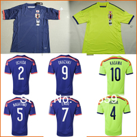


No comments:
Post a Comment